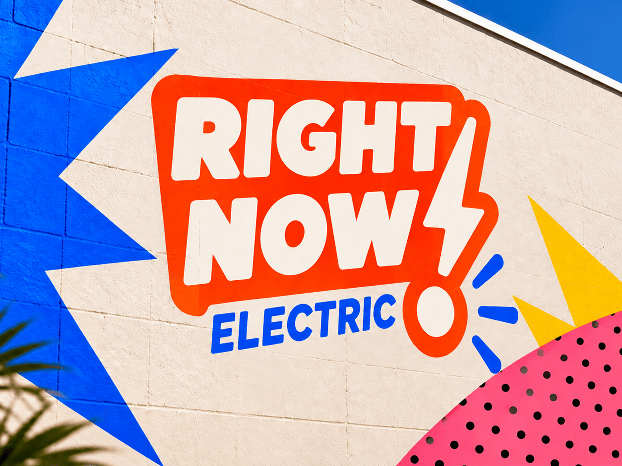
RIGHT NOW ELECTRIC
Brand strategy, visual identity, and digital experience for a residential electrical company focused on making electrical service easier.
Right Now Electric already had a strong reputation for reliable work, clear communication, and looking out for its customers. The goal was to create a brand and website that reflected those qualities while helping the business connect with local and new homeowners and support its next stage of growth.
My work included: Brand positioning, competitive research, visual identity, art direction, website strategy, UX/UI, local SEO strategy, copy direction, and Squarespace development.
The process started with conversations with the owners about their business, goals, values, and the experience they wanted customers to have. They wanted the new brand to reflect the way they already operated while becoming more recognizable in the communities they served.
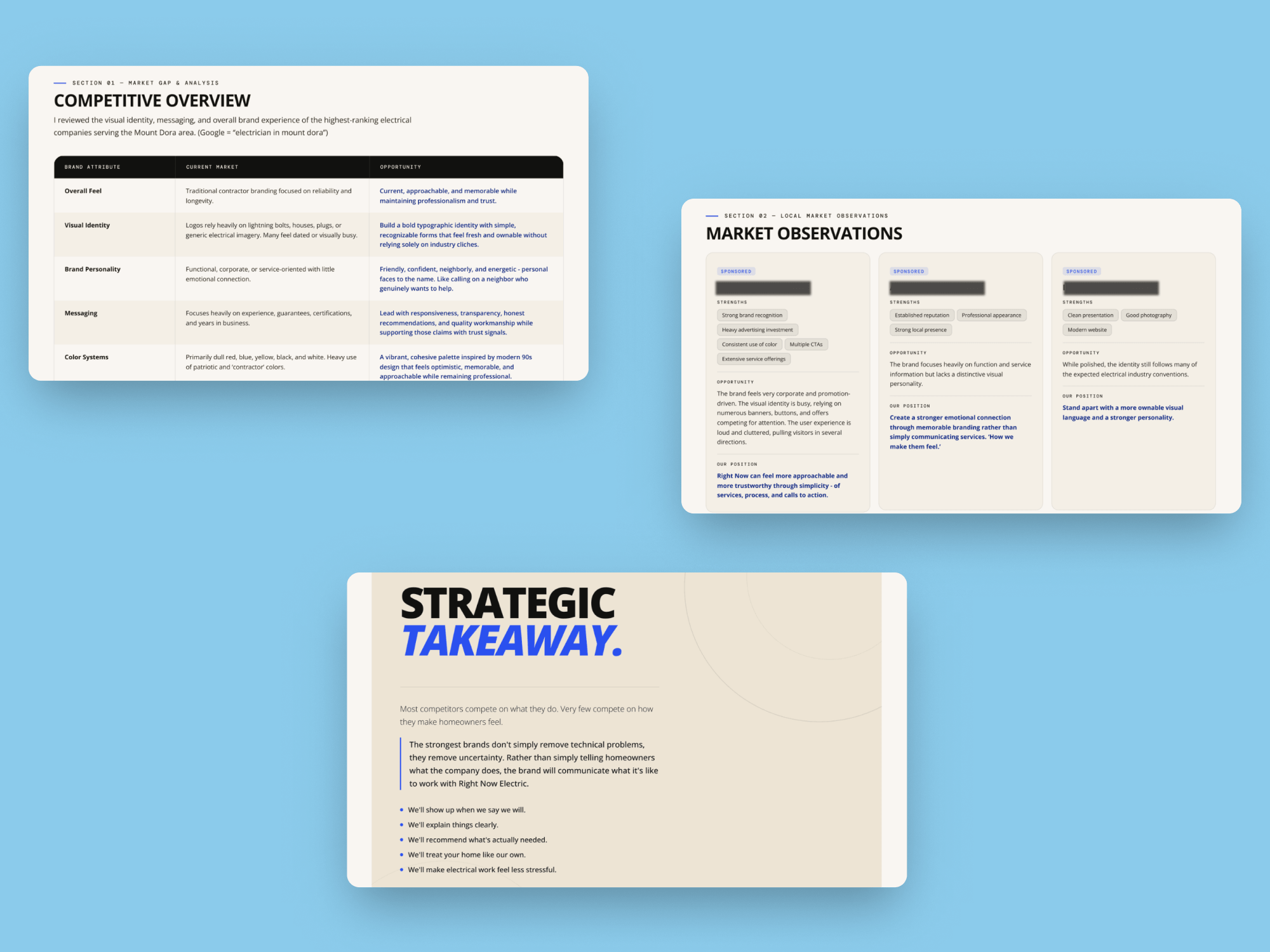
From there, I looked at the local competitive landscape, comparing what we'd discussed against the messaging, visual identities, websites, and search presence of other electrical companies in the area.
Most of the category was communicating the same basic things: years of experience, licensing, guarantees, and service offerings. Visually, there was also a lot of overlap in contractor-style colors, electrical symbols, and service-focused photography.
The research helped validate a larger opportunity: focus less on explaining what Right Now Electric does and more on what it feels like to work with them.
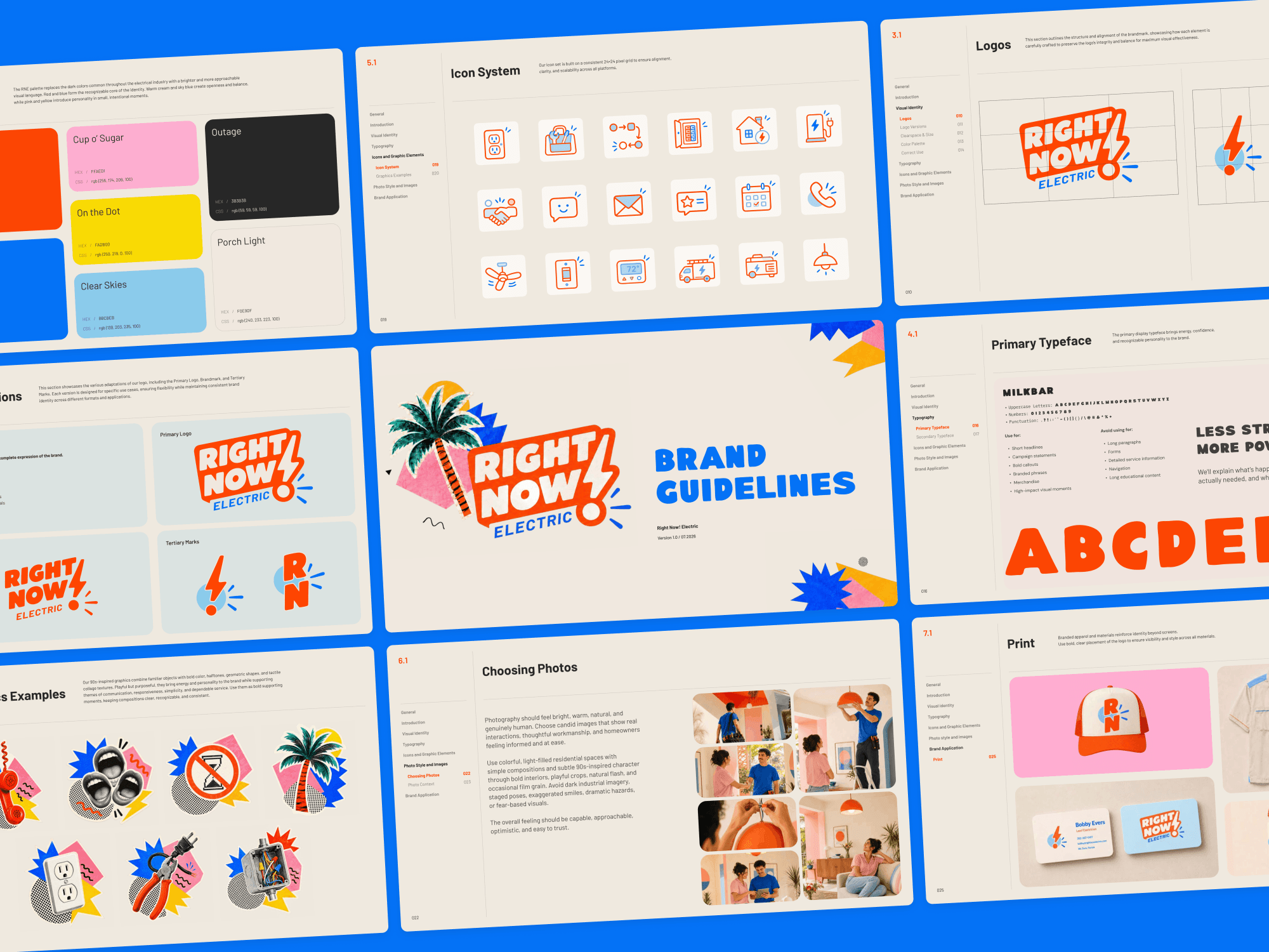
That led to a brand position built around six ideas: reliability, clarity, honesty, quality, respect, and ease. The goal was to feel professional and capable without feeling corporate, and friendly without losing credibility. Someone a first-time homeowner would feel comfortable calling, like a good neighbor.
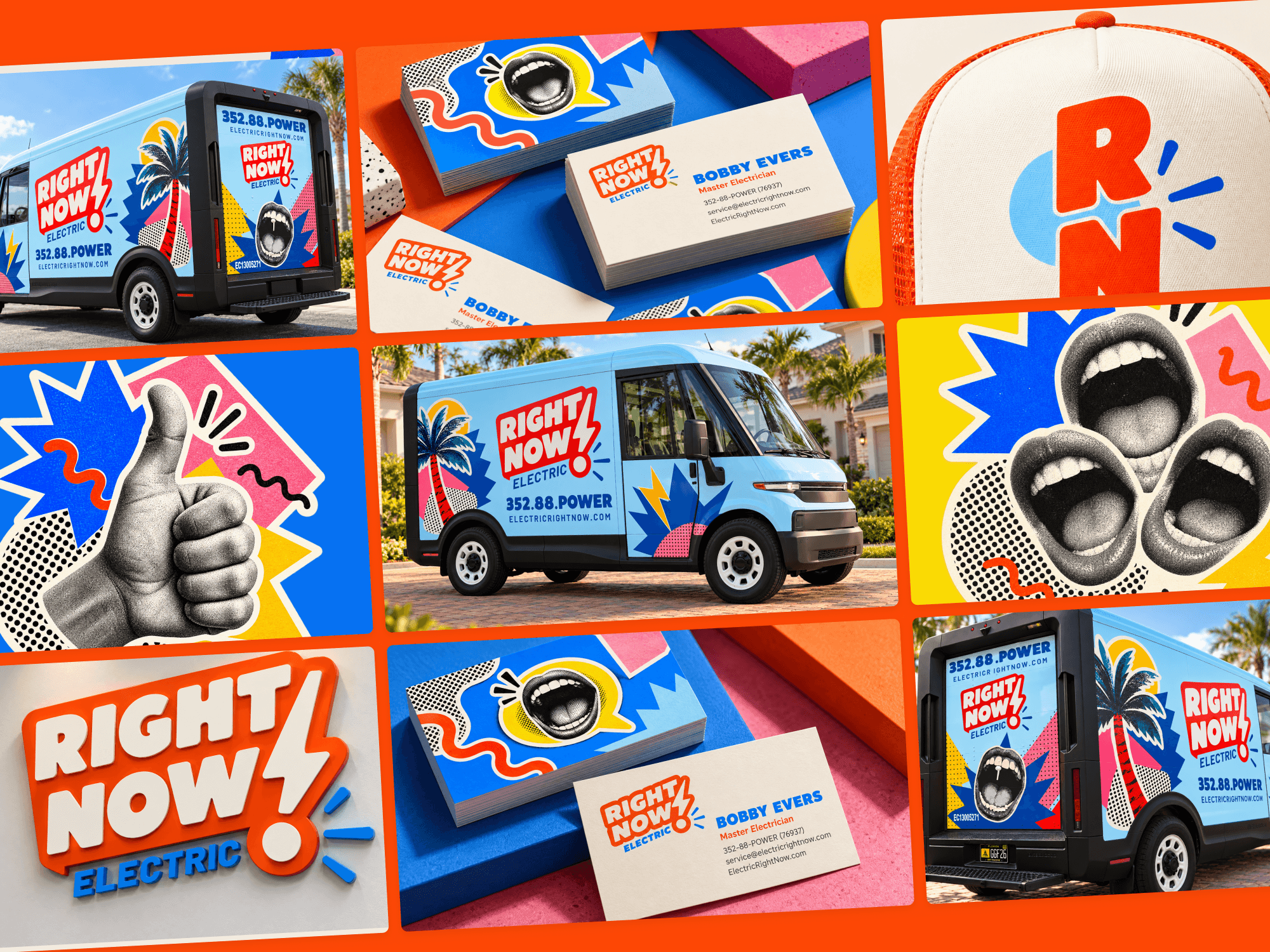
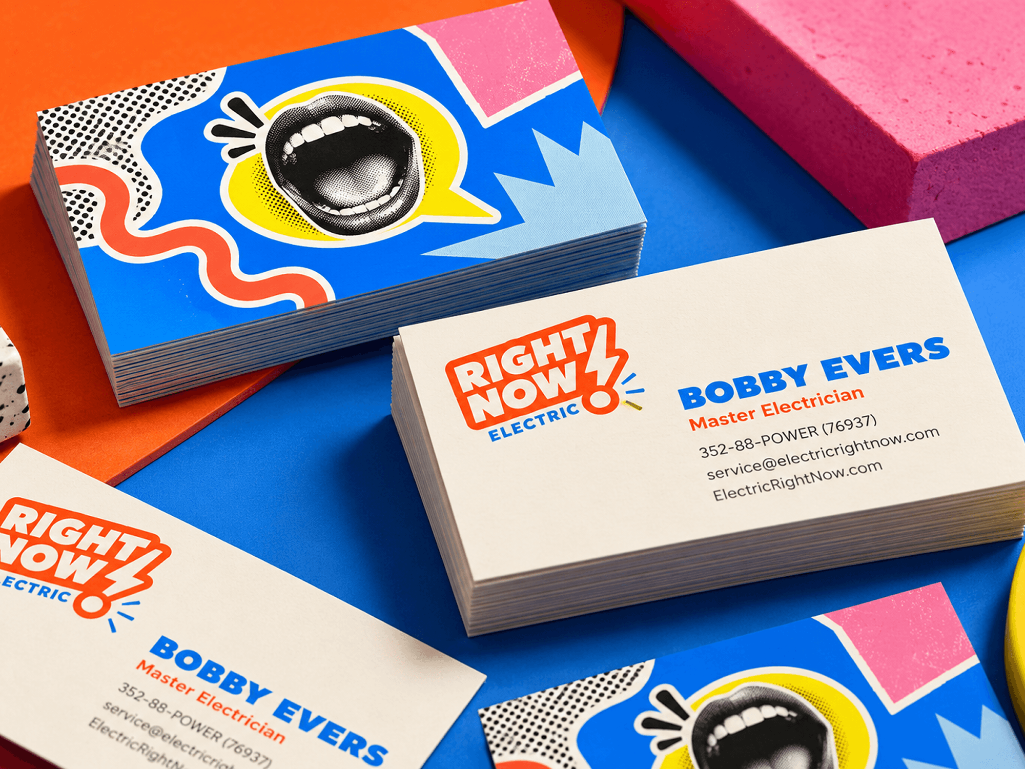
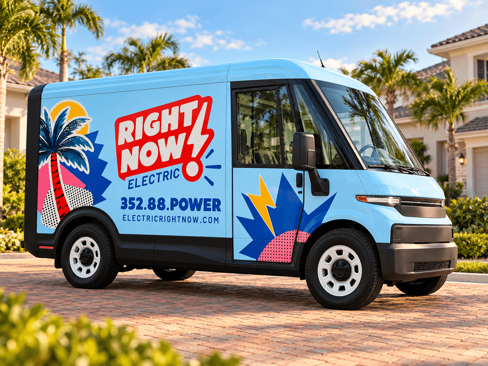
The owners also wanted a brand that would be memorable out in the field without relying on gimmicks or shock value. They envisioned something with a bold, nostalgic '90s personality that could grab attention while still feeling familiar and neighborly.
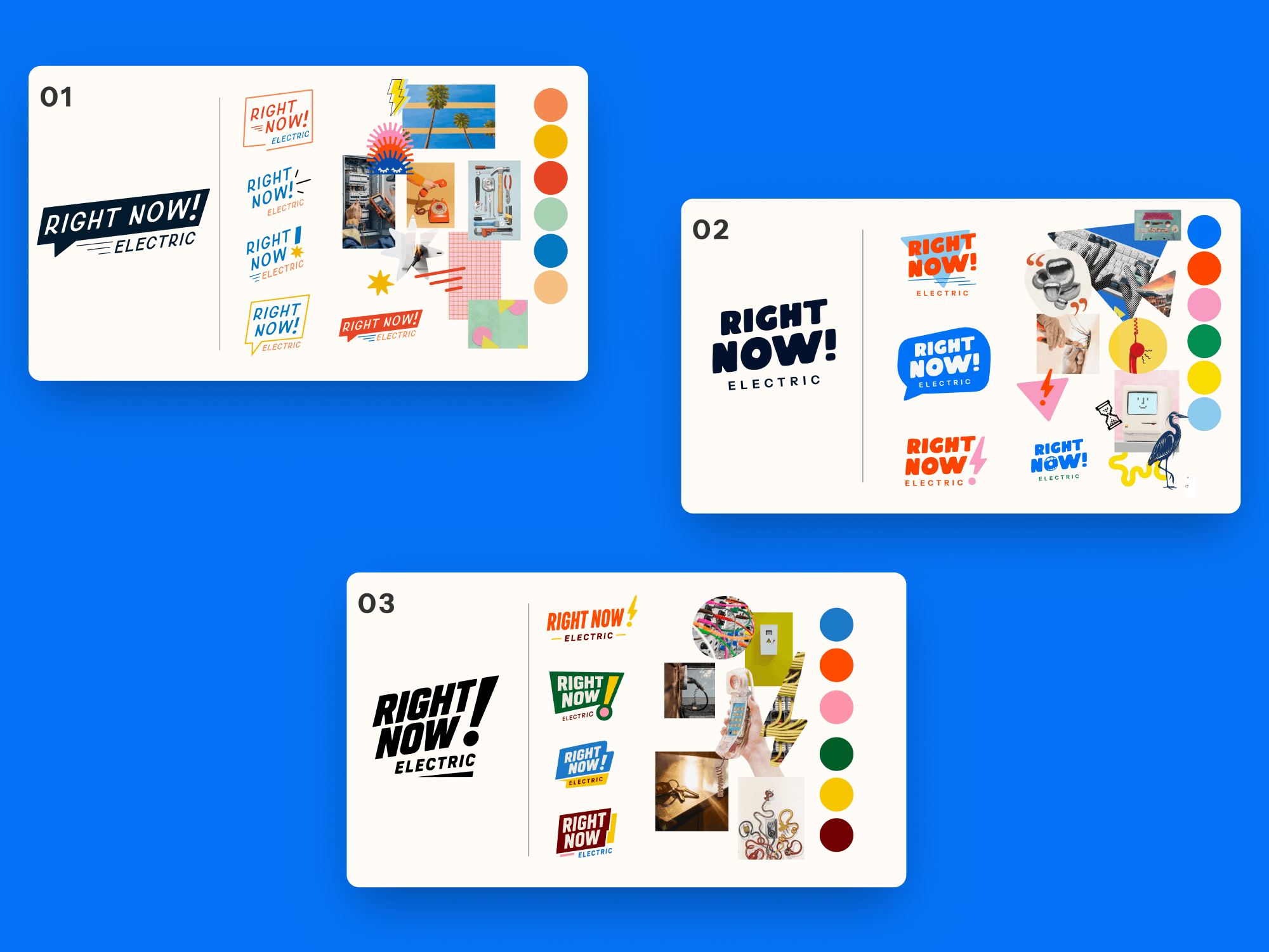
With the brand position established through client discovery and market research, I explored three visual territories built around different forms of memorability: simplicity, personality, and connection.
Each direction used a different visual language, but the underlying strategy stayed consistent: clear communication, honest recommendations, quality work, and a neighborly customer experience.
That process gave us a way to evaluate the identity on more than preference. The question became less about which logo looked best and more about which visual system best expressed who Right Now Electric wanted to be.
The website strategy carried the same principles established in the brand positioning into the customer experience: make things clear, reduce uncertainty, and make it easier for homeowners to get help.
I started with how people actually look for an electrician, often through a specific problem, service, or location rather than a general search. From there, I created a site architecture around individual services, service areas, homeowner questions, and locally relevant content. This gave customers a clearer path to the information they needed while creating a stronger foundation for local search.
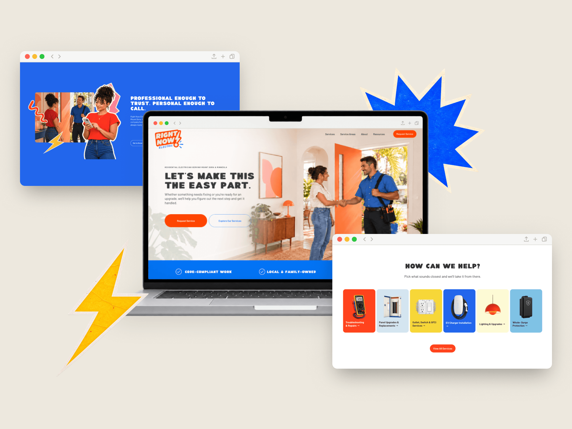
Rather than presenting a traditional list of electrical services, I organized the services overview into four categories based on what customers were experiencing or trying to accomplish.
This gave visitors a familiar starting point, even if they didn't know which electrical service they needed.
From there, individual service pages followed a consistent structure, explaining what the service involves, signs it might be needed, what to expect, frequently asked questions, and a clear next step.
The approach was designed for homeowners at different stages of understanding, from someone who knows exactly what they need to someone who only knows something isn't working. It also allowed each service to have enough depth to support informed decisions and relevant local searches.
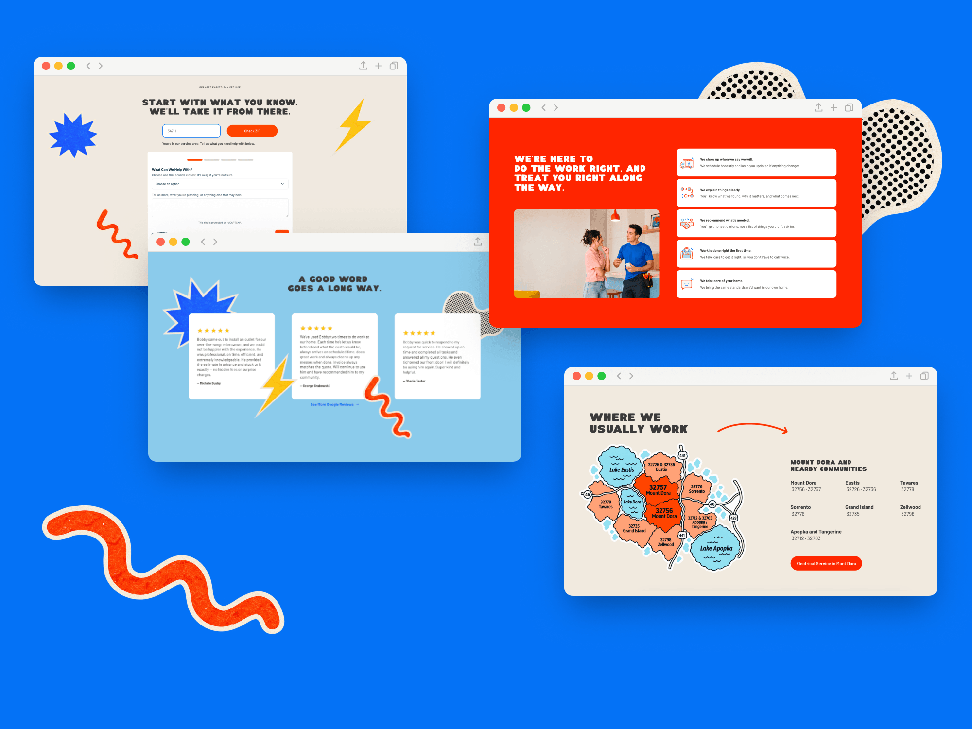
Trust was treated as part of the experience rather than something reserved for the About page. Reviews, licensing, local ownership, guarantees, service-area information, response expectations, and project photography were planned throughout the site, with key proof points appearing near moments where homeowners were being asked to take action.
The goal was to answer the question, "Can I trust these people in my home?" without making someone search for that reassurance.
One of the key UX decisions was treating service-area confirmation and requesting service as one journey rather than two separate tasks.
The ZIP check became the first step in the request flow. If the location is covered, the customer continues with their ZIP already carried through. If it falls outside the standard service area, they're given a clear alternative next step rather than reaching a dead end.
This removed an unnecessary step between checking availability and requesting help, keeping the process straightforward from beginning to end.
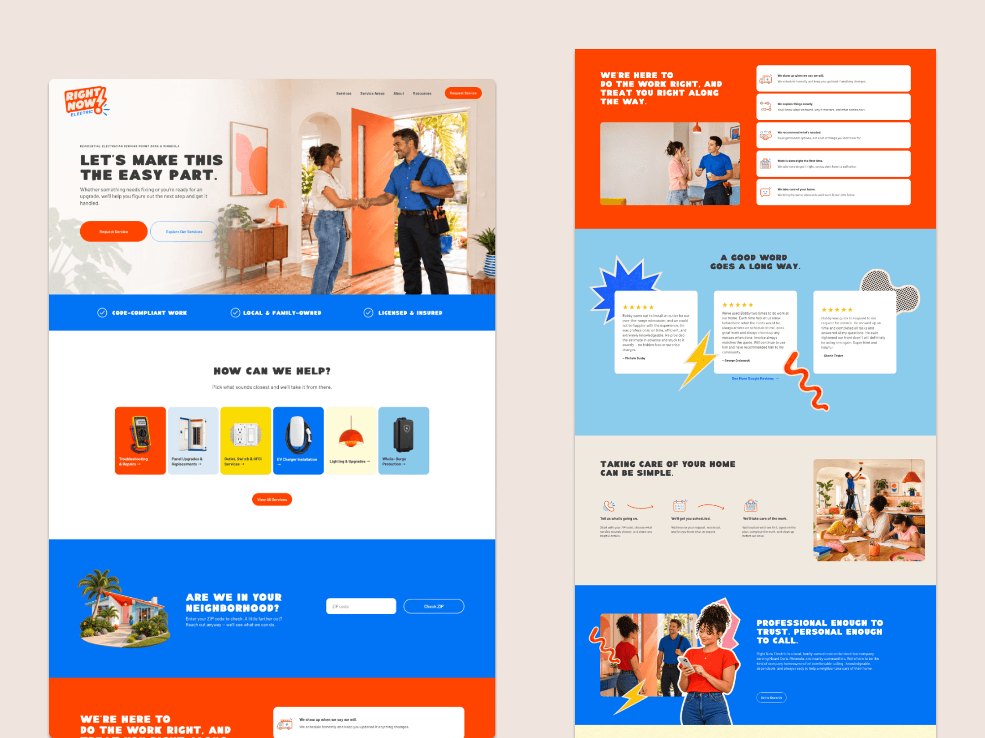
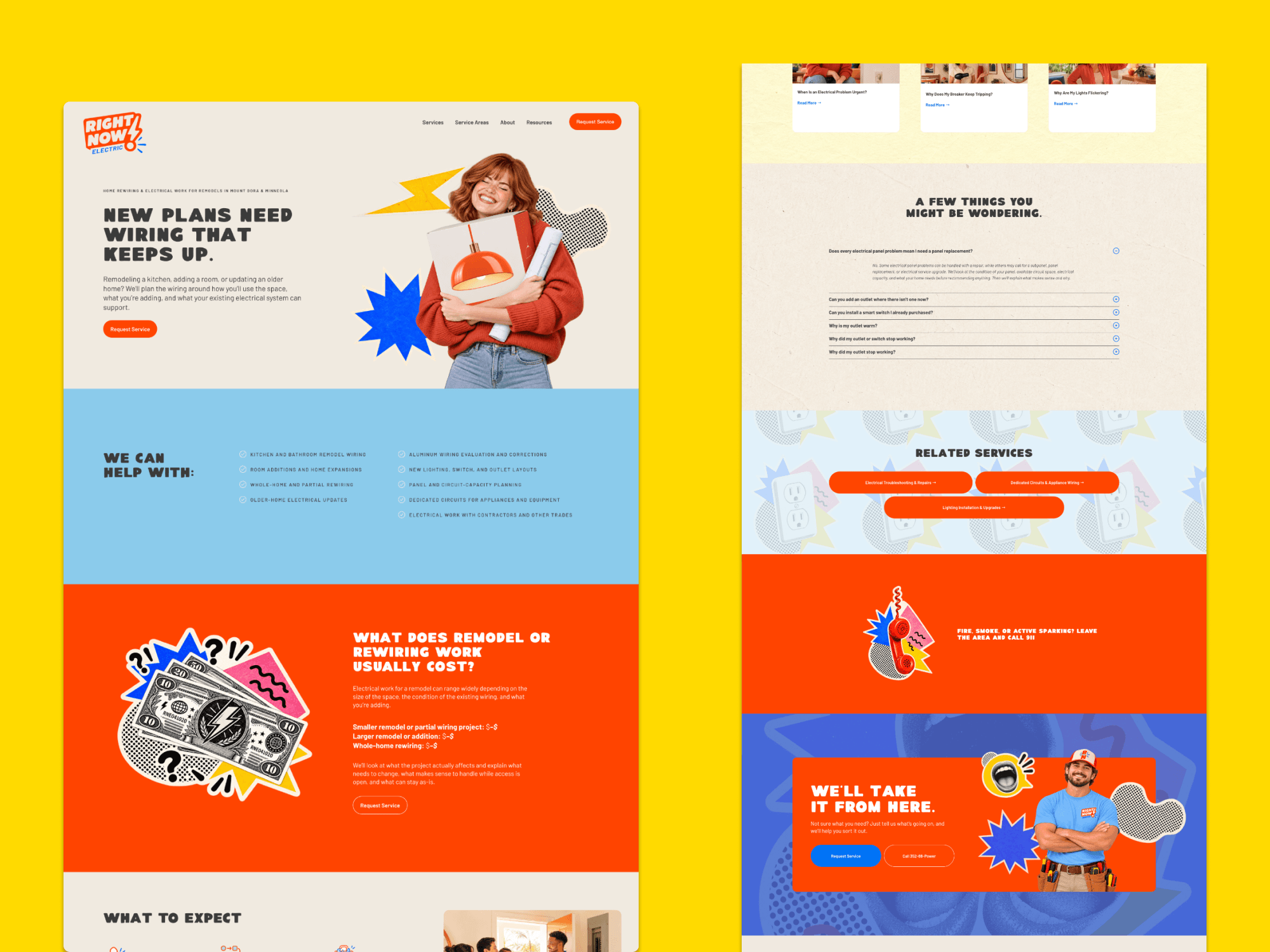
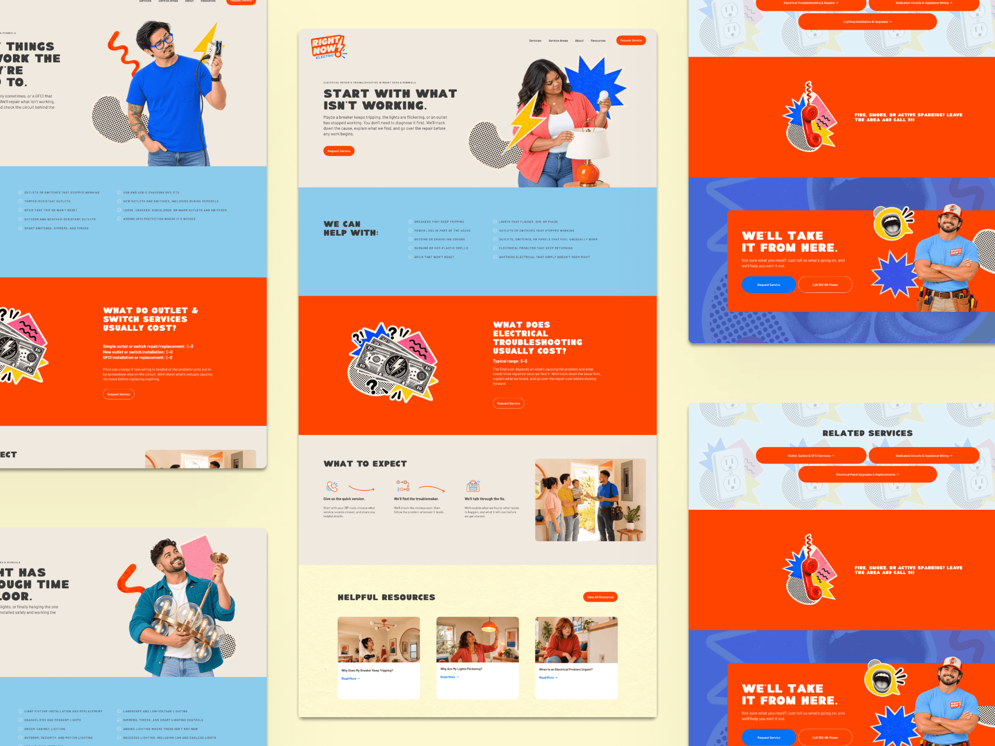
The final system brings brand strategy, visual identity, and digital experience together around the experience Right Now Electric wanted to create: clear, capable, neighborly, and memorable.
From the identity and photography to the site architecture, service pages, local search strategy, and request flow, each part was designed to reinforce the same qualities: honest communication, reliable work, and a more personal customer experience.