
RENEW
Brand identity and visual system for a
student ministry focused on discipleship, community, and spiritual growth.
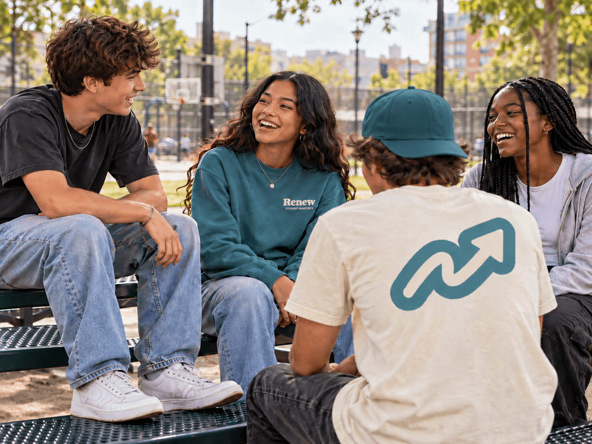
Renew had a parent brand, an established color palette, and a selected secondary typeface. The new identity needed to work within those existing guidelines, but the visual direction itself was open.
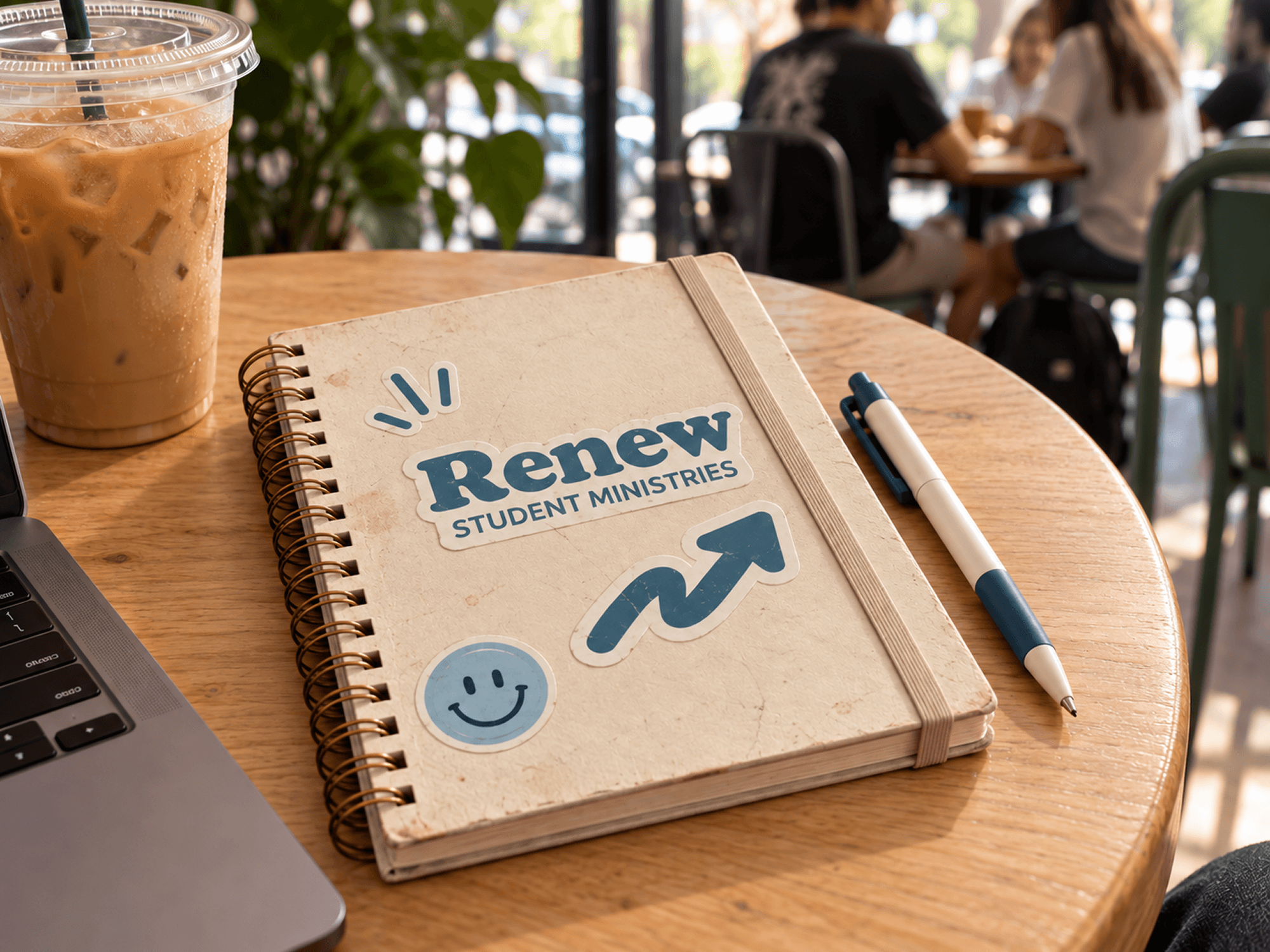
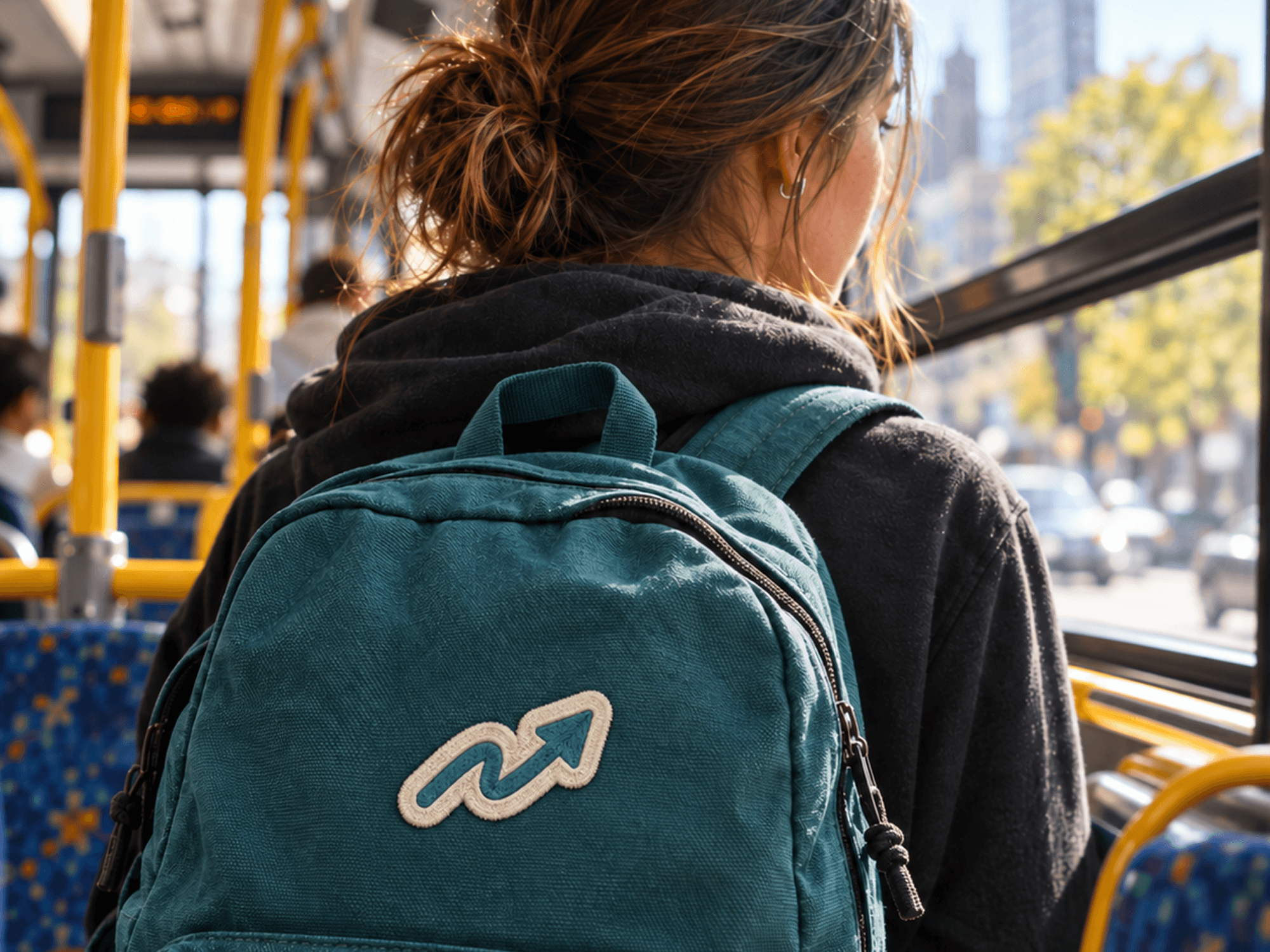
The selected concept came from the idea that following God is a direction, not a perfectly straight path. The arrow points upward, but its imperfect shape reflects the reality that growth can be messy, we can change course, and keep moving forward.
The sticker-like quality of the identity was intentional. The visual direction pulled from outdoor and adventure graphics, including trail badges, national park graphics, and the kinds of stickers that collect on water bottles, camping gear, backpacks, and other everyday items.
That felt like a natural fit. Faith is something students are growing into, actively experiencing, and carrying with them, not something that only exists inside a building.
The system was designed to extend easily into apparel, signage, journals, stickers, and other student-facing materials, giving Renew an identity that could feel flexible, familiar, and part of their everyday life.
Work completed during my time at Lifted Logic. Design and execution were my own, with feedback from the team throughout the process.