
ERA
Brand identity and visual direction for a medical aesthetics practice.
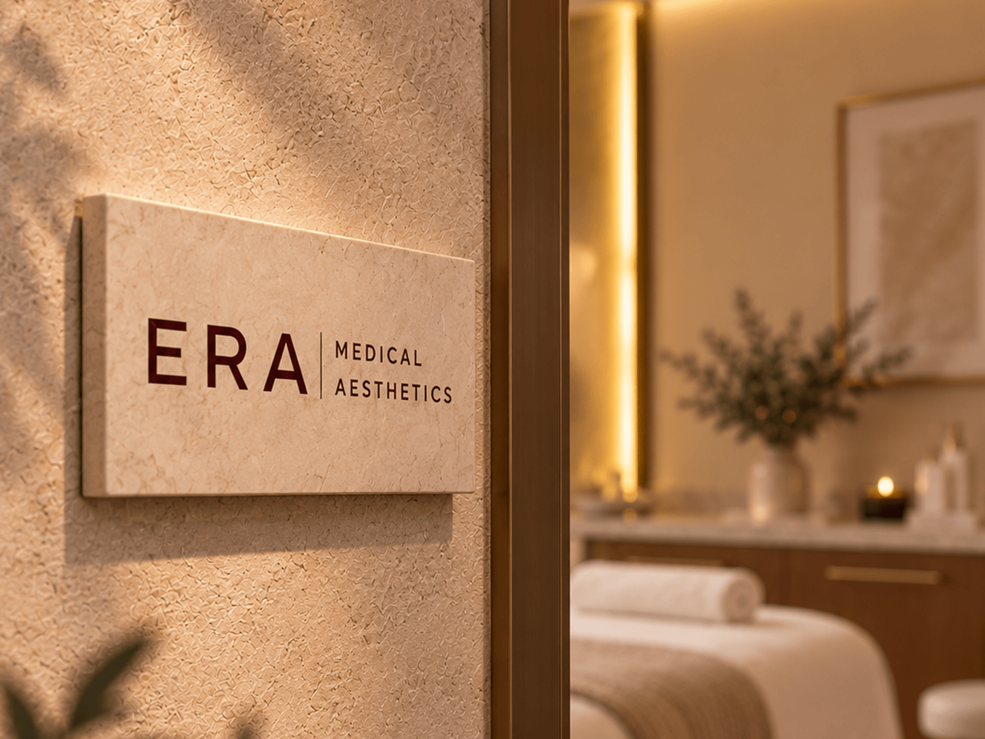
ERA needed an identity that felt sophisticated and approachable while standing apart in the medical aesthetics space. The chosen direction called for a clean, modern sans serif typeface, so much of the elegance and personality needed to come through a supporting symbol or seal.
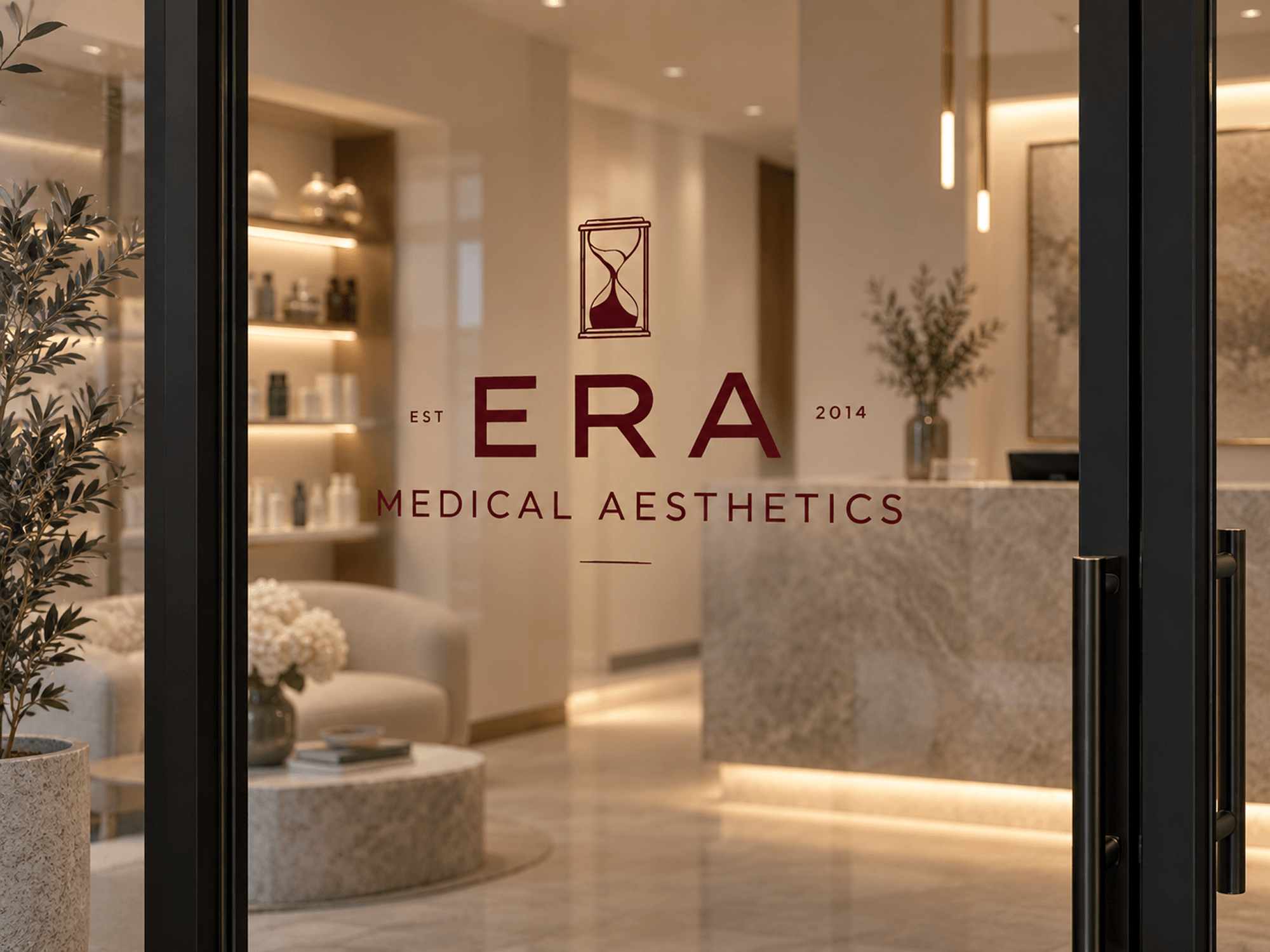
I explored layered forms inspired by chronostratigraphy, organic wave textures, and a tree-inspired concept, each offering a different way to represent the passage of time. The goal was to find a symbol that felt meaningful without becoming overly literal or decorative.
The selected direction centered on an hourglass-inspired mark, bringing the concept of time into a simple, recognizable form. Paired with modern typography, rich burgundy, and warm neutrals, the symbol gave the identity a more refined character while keeping the overall system clean and contemporary.

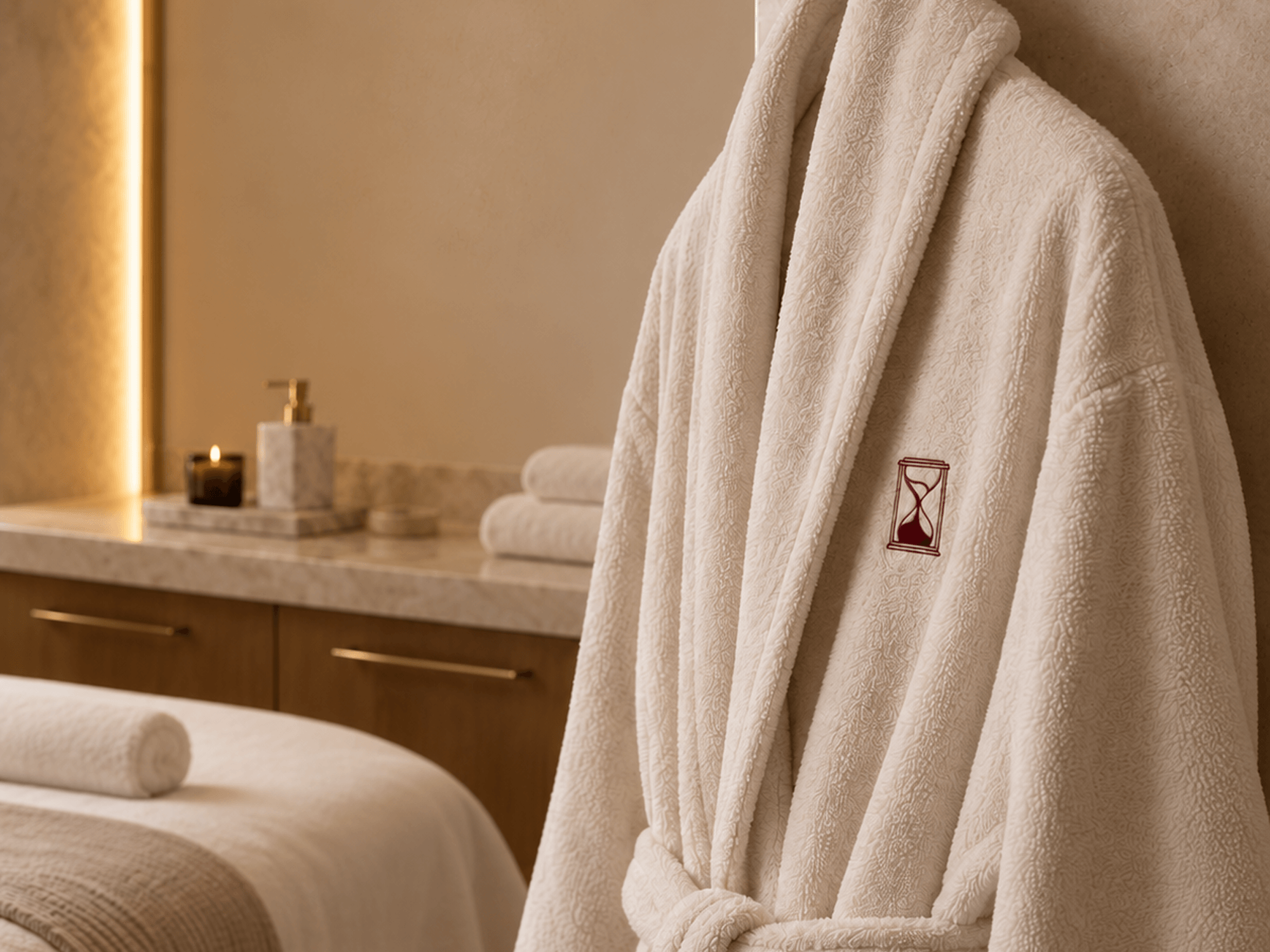
Work completed during my time at Lifted Logic. Design and execution were my own, with feedback from the team throughout the process. Brand applications are conceptual mockups.