
CHILLAX
Packaging design and illustration for complementary daytime and nighttime CBD formulas,
using playful visual storytelling to explore focus, rest, and renewal.
Chillax started with a name and product requirements provided. My role was to develop packaging concepts that captured the personality of the name while connecting the visuals to each product's purpose.


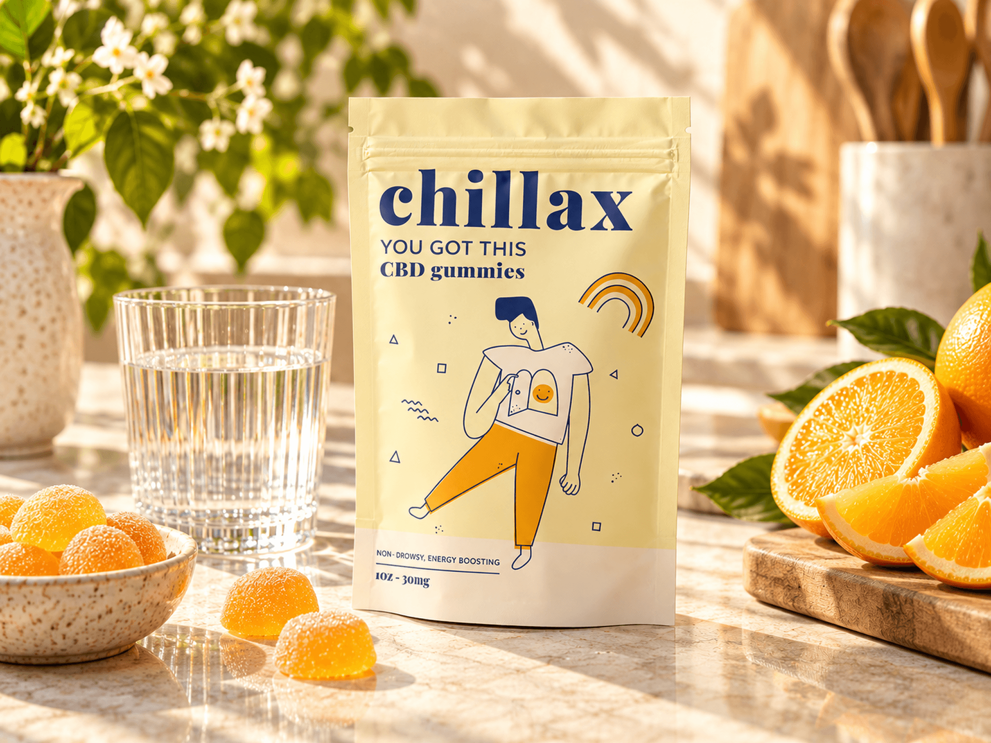
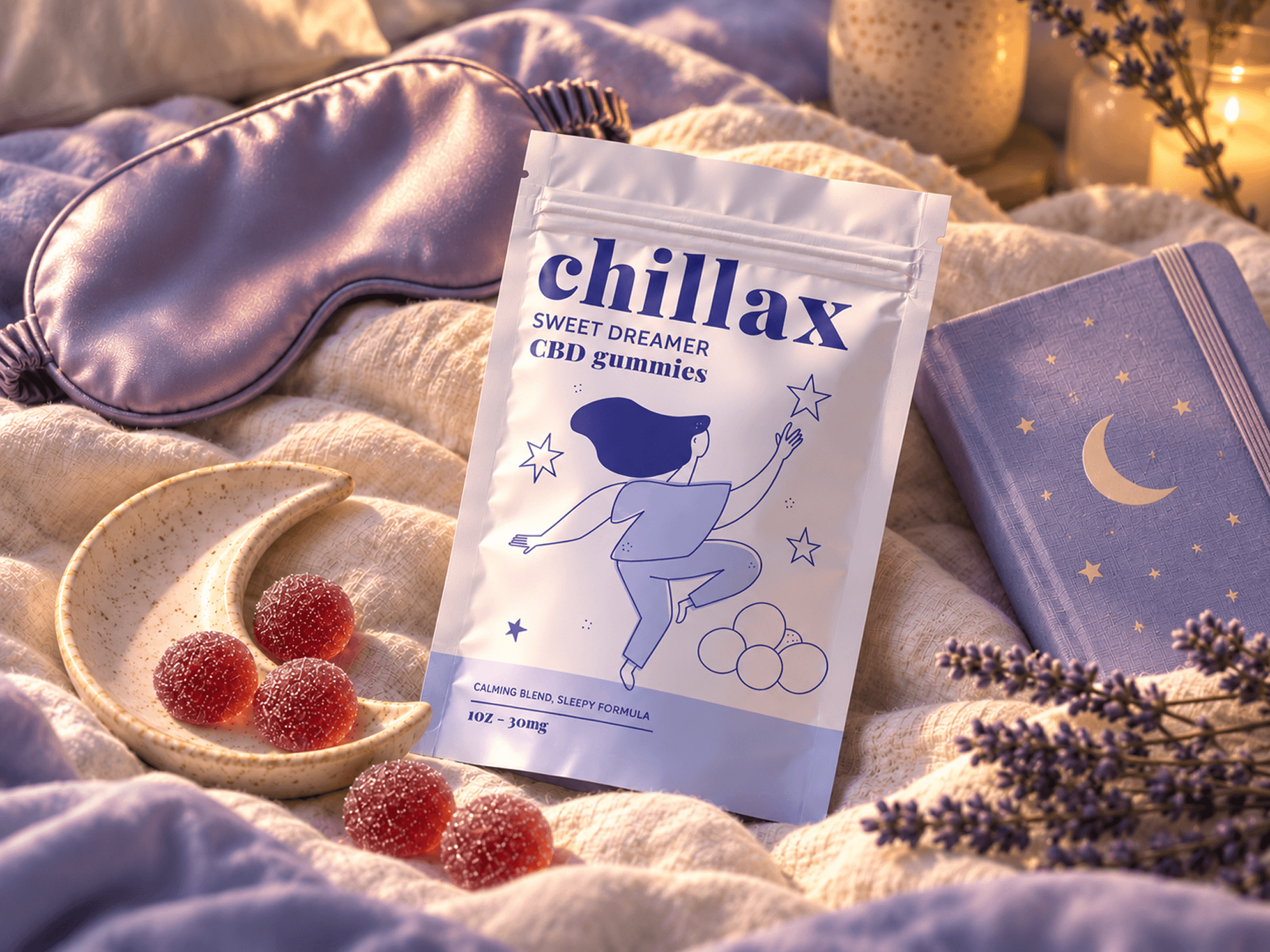
The two SKUs were designed to complement each other while serving different purposes. The daytime concept came from the idea of peeking inside to discover that what you need is already there. Sometimes you just need a little help slowing down, finding focus, and tapping into it.
For the nighttime formula, lavender tones helped convey calm and rest, while the dreamlike illustration explored the idea that prioritizing deep sleep can be its own kind of adventure, allowing you to recharge and, figuratively, reach for the stars.
The final designs paired custom, product-driven illustrations with complementary color palettes and simple typography. I kept the logo intentionally minimal so it wouldn't compete with the more detailed illustrations, allowing each formula to have its own personality while maintaining a cohesive look across both packages. This also helped preserve a clear hierarchy for the product information.