
BROOKLYN BILTONG
Brand strategy, identity, packaging, and creative direction for a South African snack brand born in Brooklyn.
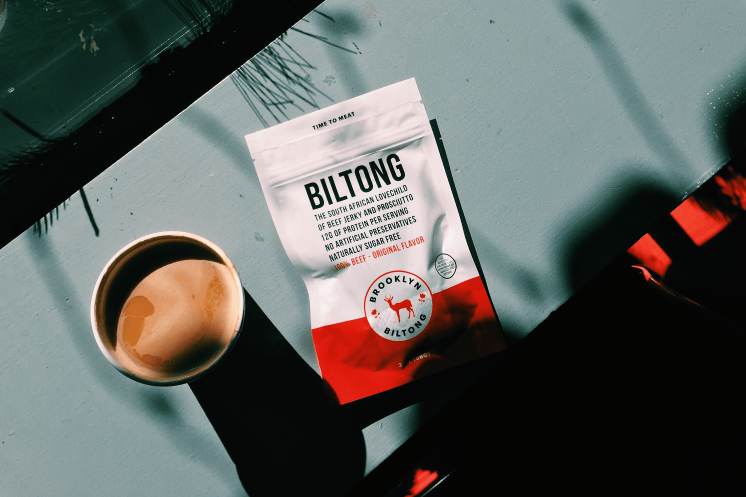
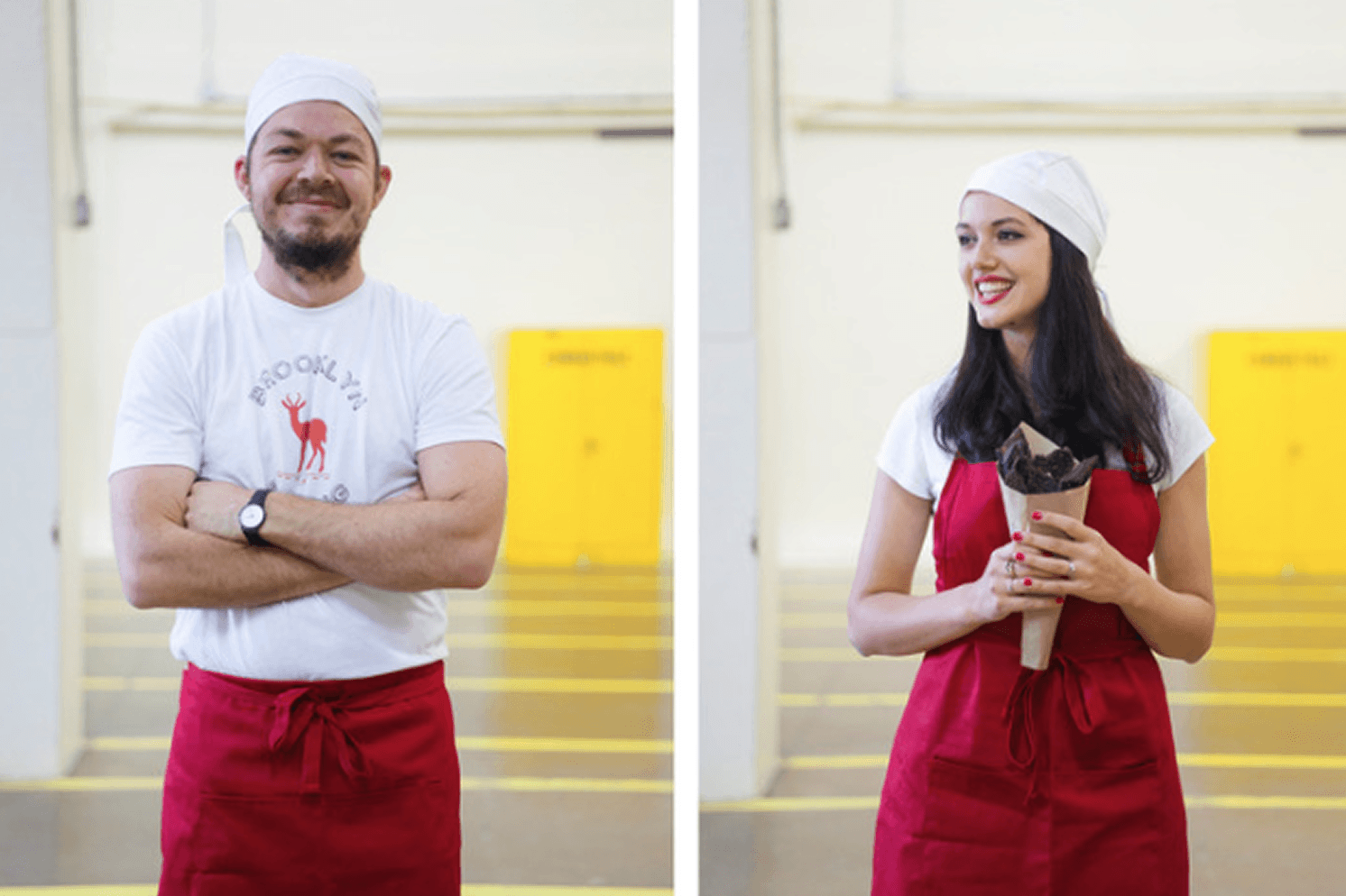
Brooklyn Biltong began in our kitchen in 2012. After serving biltong at our wedding and watching our American friends fall in love with it, my husband Ben and I decided to introduce this South African staple to a wider market.
I led branding, creative direction, and marketing as we built the business from the ground up, finding a place for an unfamiliar product in an already established snack category.
Over the next decade, my work evolved alongside the business, from creating the original identity and packaging to shaping campaigns, digital experiences, and retail materials as the brand grew into a national retail presence.
At the time, the American jerky market was dominated by dark, rugged, traditionally masculine branding, often associated with hunting, trucking, and outdoor culture. We saw an opportunity to position biltong differently.
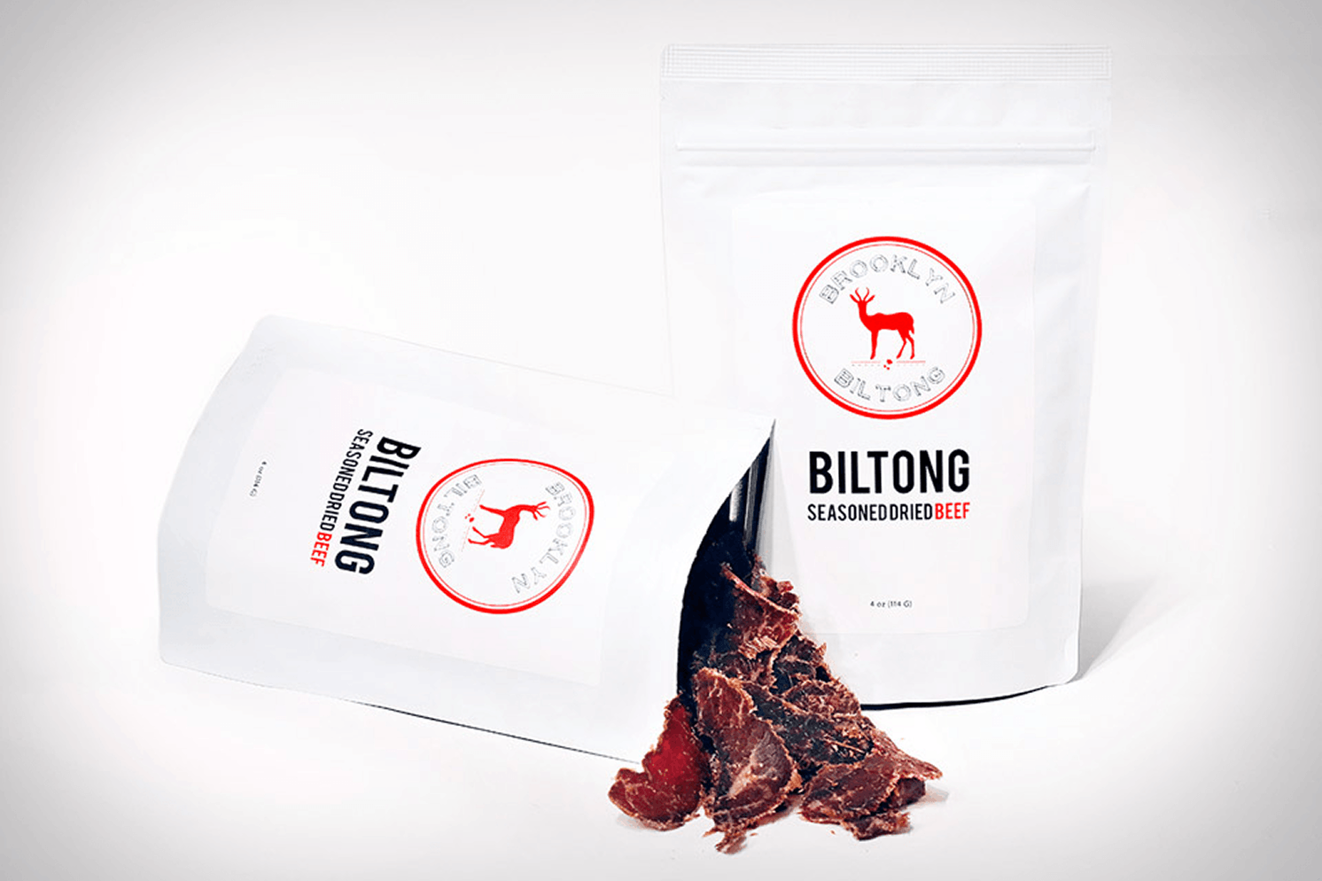
Our original white packaging was a deliberate departure from the category. Clean, simple, and approachable, it was designed to make the product feel relevant to a much broader audience, from families and young professionals to fitness enthusiasts and everyday snackers.
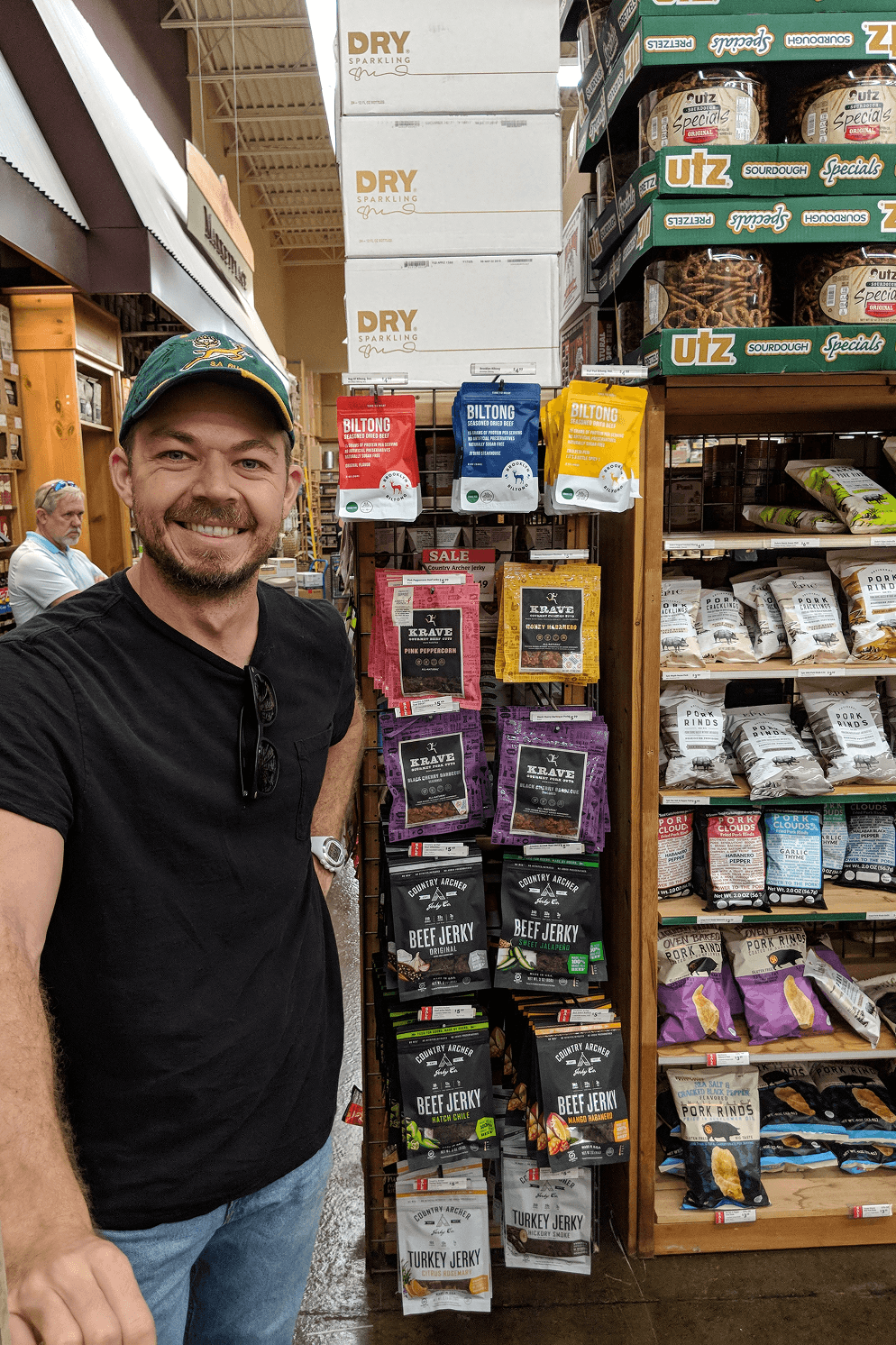
Because biltong was still unfamiliar to most American consumers, our messaging needed to make it approachable without losing its South African roots. We coined phrases like "The South African lovechild of prosciutto and jerky" and "Your new favorite jerky" to introduce the product in familiar terms.
Copywriting was just as central to the brand as its visual identity. We maintained a very consistent voice across every touchpoint: trustworthy, authentic, conversational, and refreshingly honest. We believed in letting the product speak for itself instead of pushy tactics. There had to be a distinctly 'New Yorker' sensibility to it, with a little wit and personality that made the brand feel as human as the Brooklynites behind it.

Packaging meat products came with another layer of complexity. Every design had to meet strict USDA labeling requirements, with detailed regulations around what information needed to appear and how it was presented. Clarity was already a core brand value, so finding ways to communicate all that required information without compromising the simplicity of the packaging became a design exercise in itself.


As the category evolved and competitors began adopting cleaner packaging, we saw an opportunity to differentiate again. We partnered with Brooklyn-based agency Little Furry to evolve my original identity into a bolder, more colorful direction. They developed an updated logo, brand guide, and the first series of bright packaging designs.
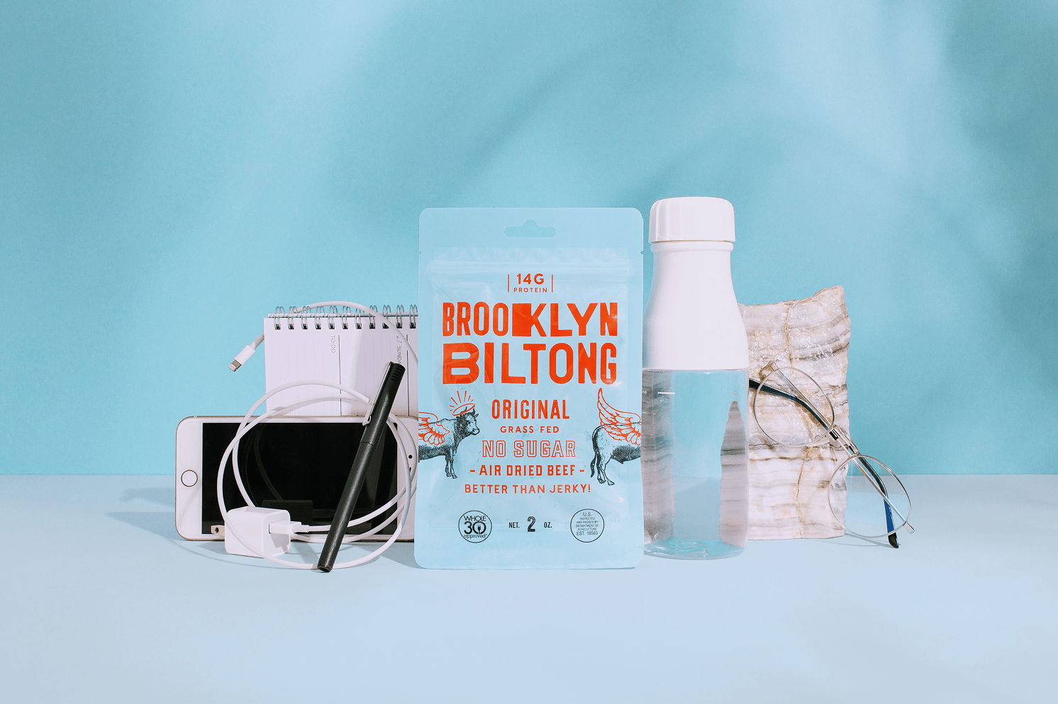
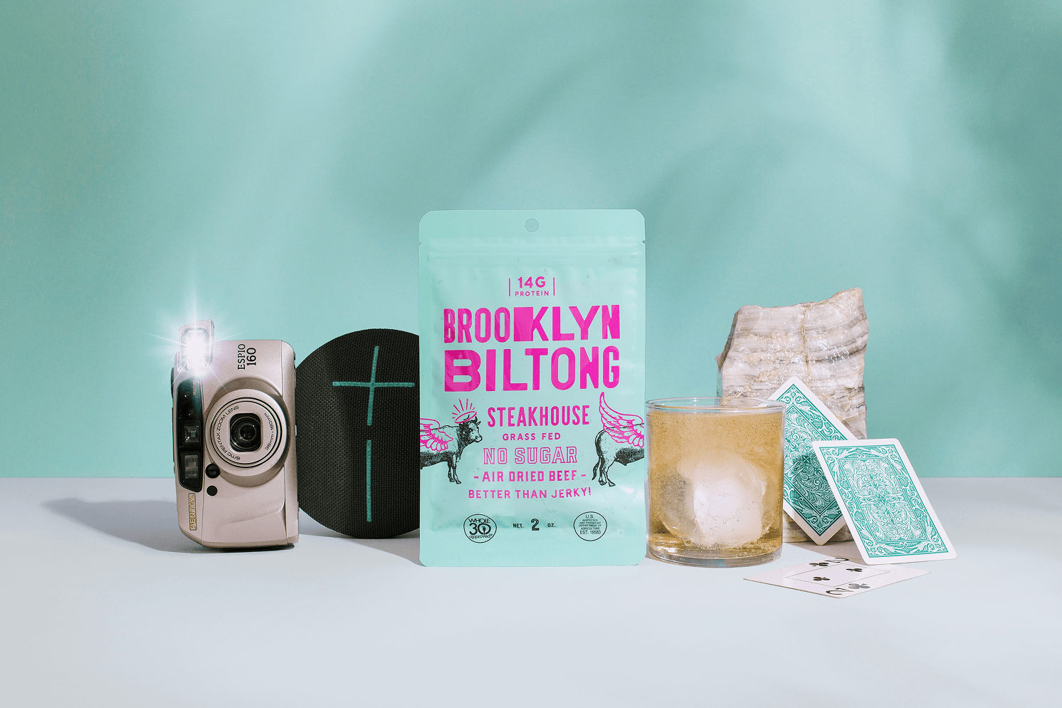
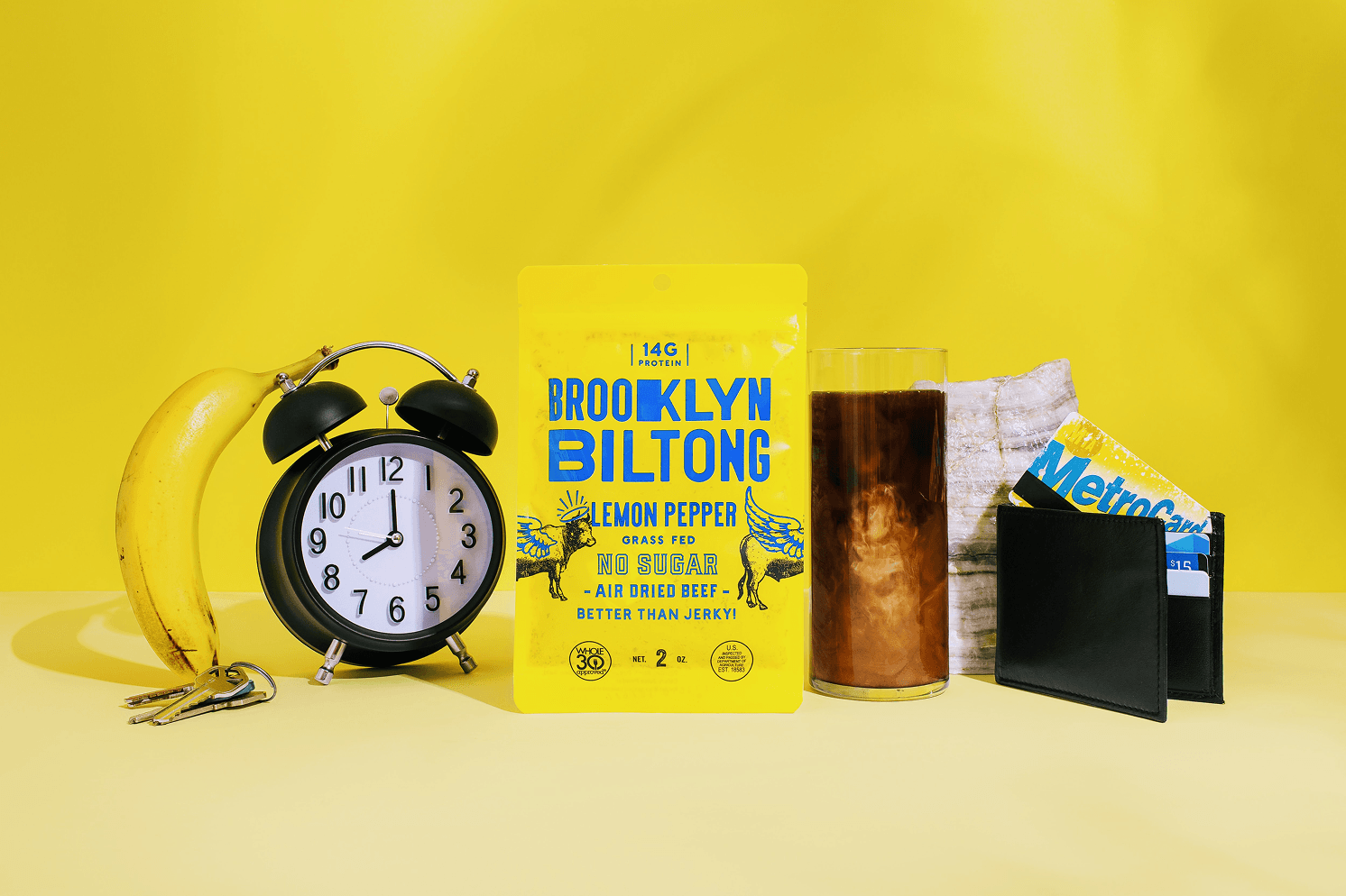
Ben and I also developed and named our original "Naked" flavor in 2017 following the restrictive Autoimmune Protocol (AIP) diet. The name reinforced our straightforward, ingredient-conscious approach to the product.
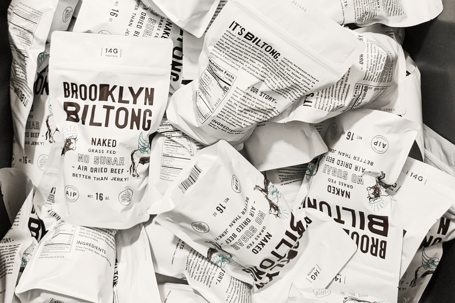
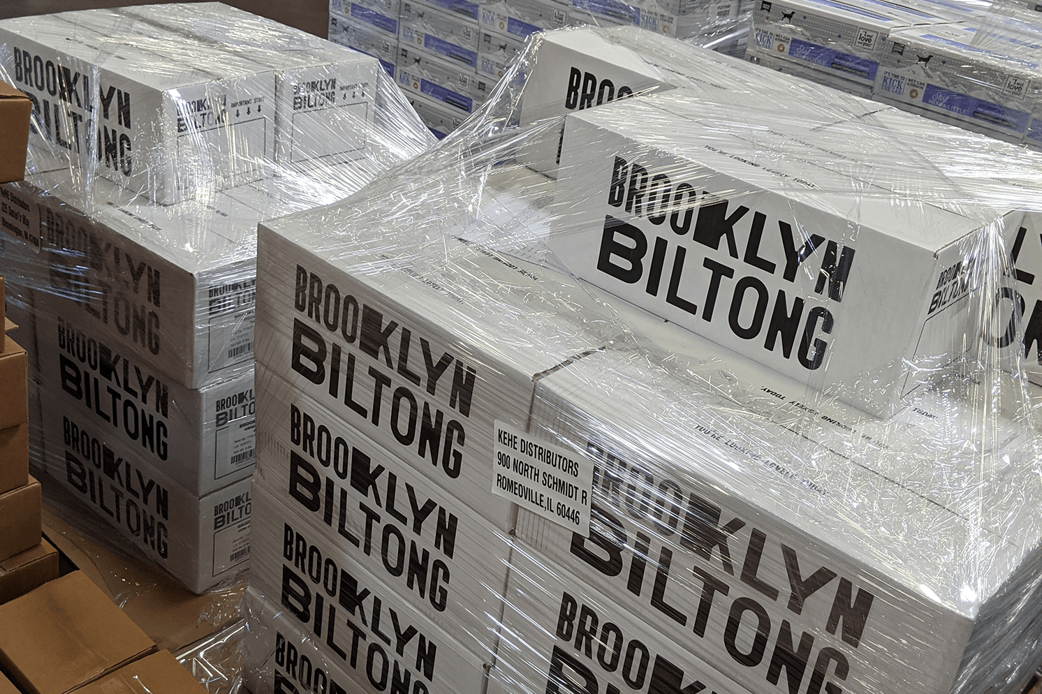

As Creative Director, I expanded our refreshed identity across illustrations, marketing boxes, retail print materials, presentations, and other branded applications. My role extended across the brand's visual communication and marketing, developing and maintaining brand assets, contributing to campaigns, managing social media at various stages, and providing creative direction to our team of freelance creatives.

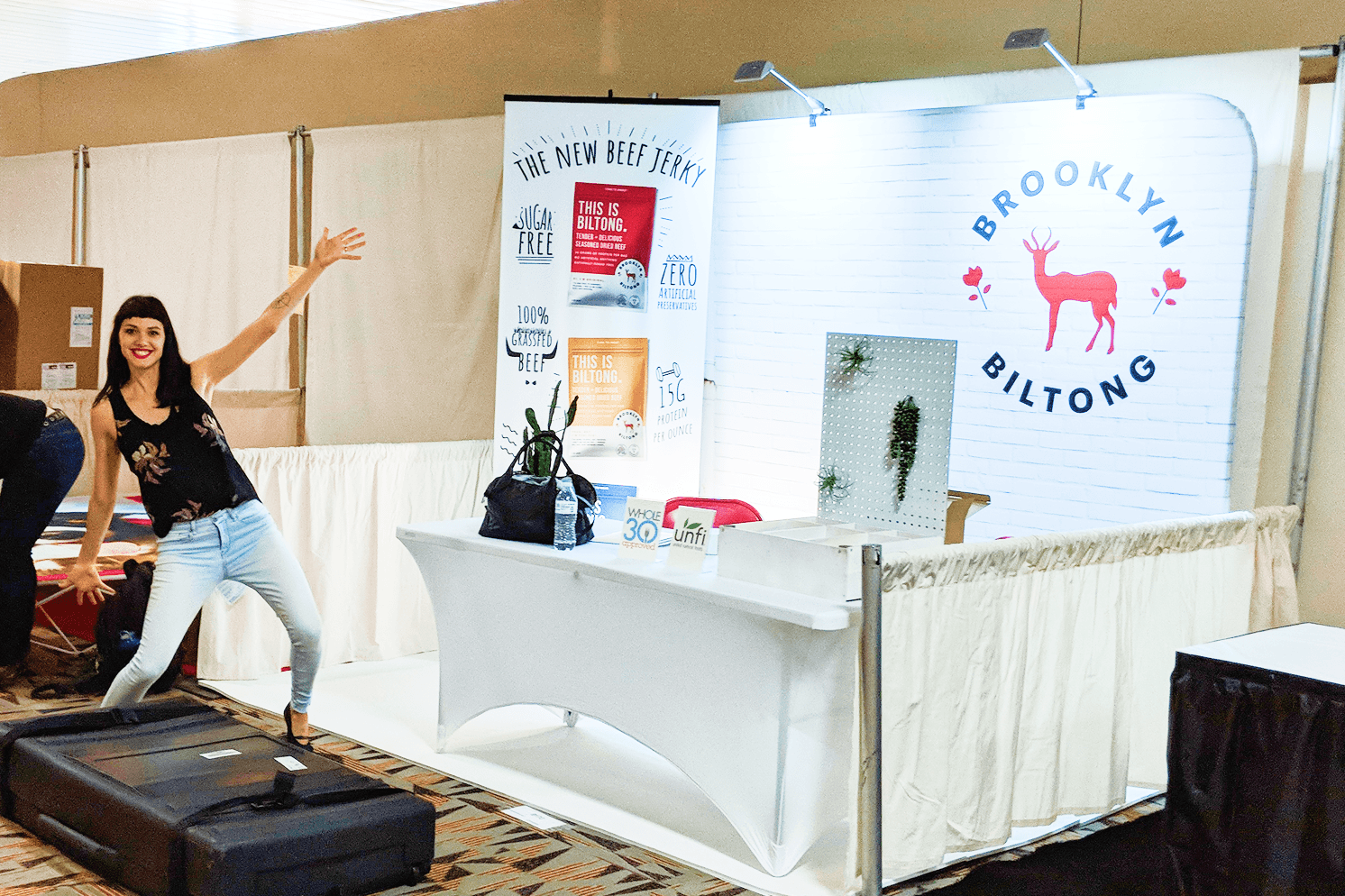
What began at local farmers markets grew through grassroots marketing, a successful Kickstarter campaign, and industry exposure through events like Expo East.
By the time we sold the business, Brooklyn Biltong was carried in nearly 1,000 retail locations and had surpassed $1 million in sales revenue.
The company has since continued to grow under new ownership, reaching several major national retailers. Although its brand direction and founding values have changed, I'm proud of the original strategy, identity, and foundation we built.
My work reflects the brand during my involvement as co-founder and Creative Director. The later brand expansion was developed in collaboration with Little Furry. Current packaging, branding, and business decisions are not my work.