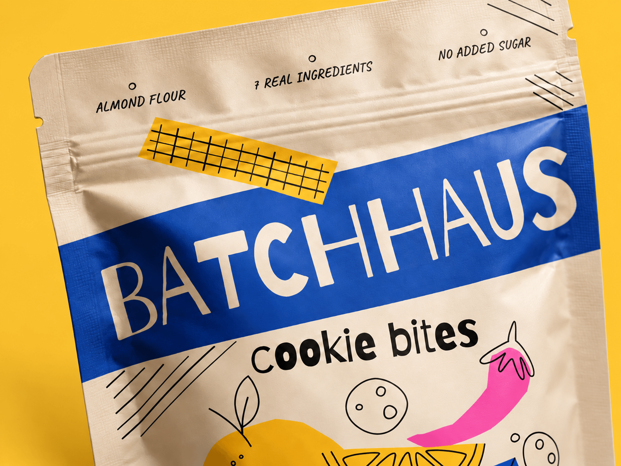
BATCHHAUS
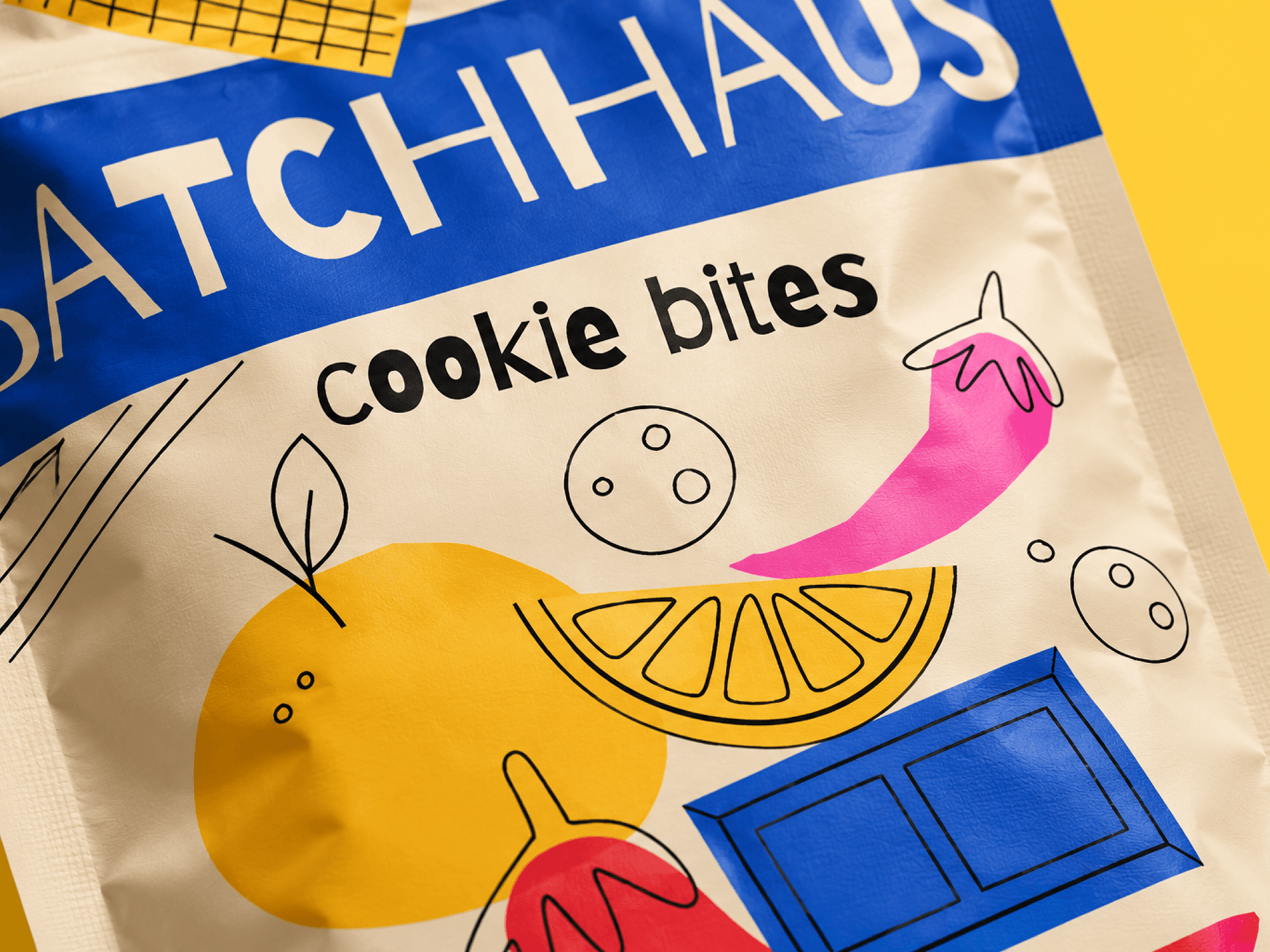
Concept brand and packaging design developed for ePac, using a focused brand process to create the naming, visual direction, illustration style, typography, color, and final package design.
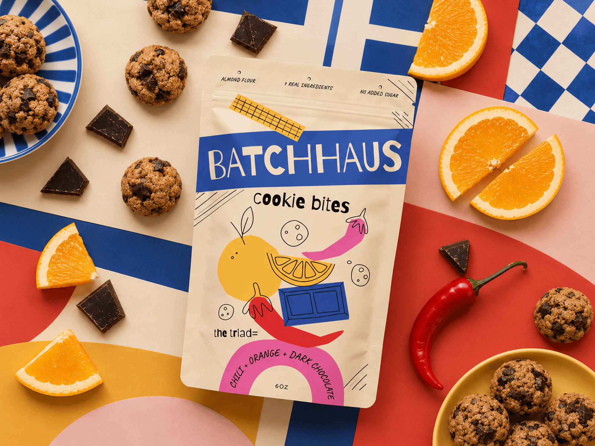
Because the project was centered around packaging, I worked through a condensed version of a larger brand process. I explored naming, visual references, typography, color, illustration styles, and composition before bringing those pieces together into the final direction.
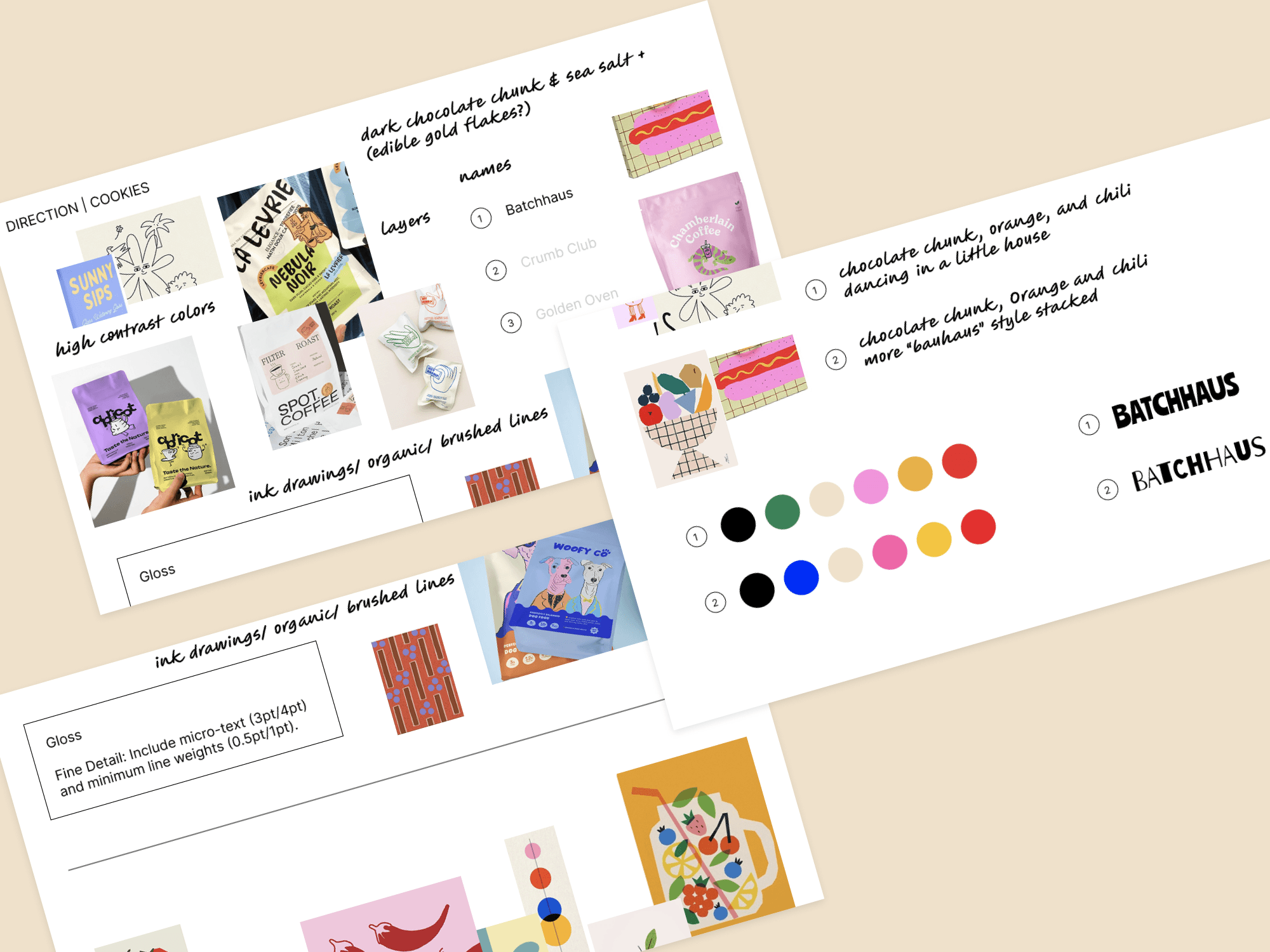
The visual concept leaned into high-contrast color, loose ink-style illustration, and a playful mix of organic and graphic forms. I also considered the requirements of the package itself, print finish, line weight, fine detail, and how the artwork would display once printed.
From there, I narrowed the direction into a small but cohesive system of type, color, illustration, and graphic elements to complete the system.